
Clear Digital is a founding member of Myrious Group's expertise-driven agencies.
Myrious Group is an independent holding company enabling forward-thinking brands to achieve breakthrough performance through power of orchestration.
Visit Myrious.com
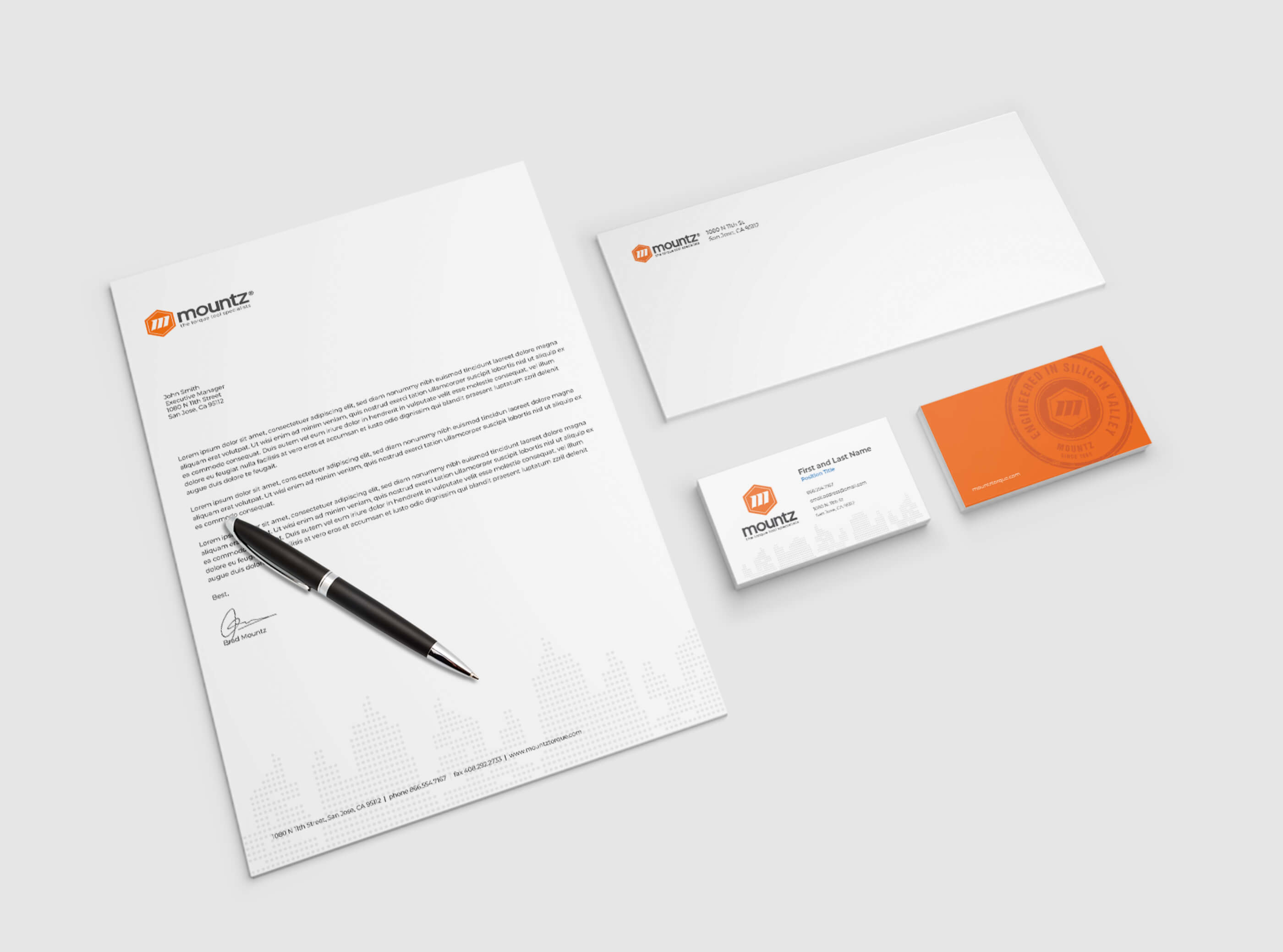
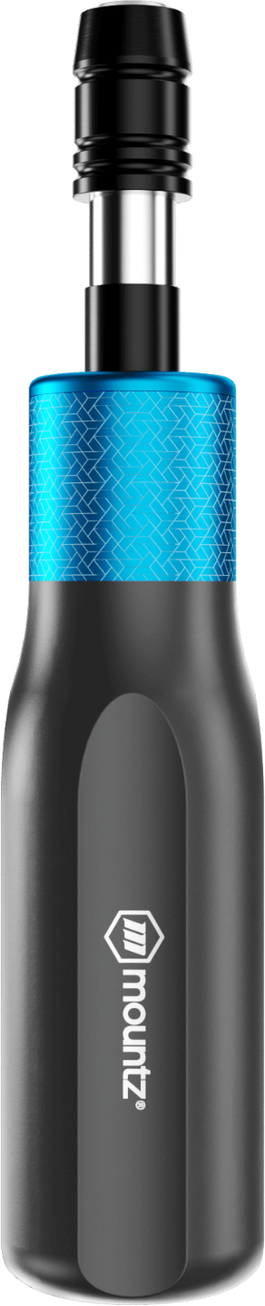
When it came to the Mountz logo, we balanced being respectful of the symbolic approach of the existing logo with taking full advantage of the opportunity to modernize and make that symbolism more accessible. The previous logomark focused on an M made out of screw threads in the center of a hex, but many people didn’t understand it. With the selection of a new font and a simplification of the design, we were able to reinforce the fastener reference with a key-line inside the hex and sharpened up both the M shape and the threading. We also conducted an industry color study to identify color opportunities. When we presented the advantages of orange, it perfectly aligned with the Mountz legacy, as it was the company’s original brand color.
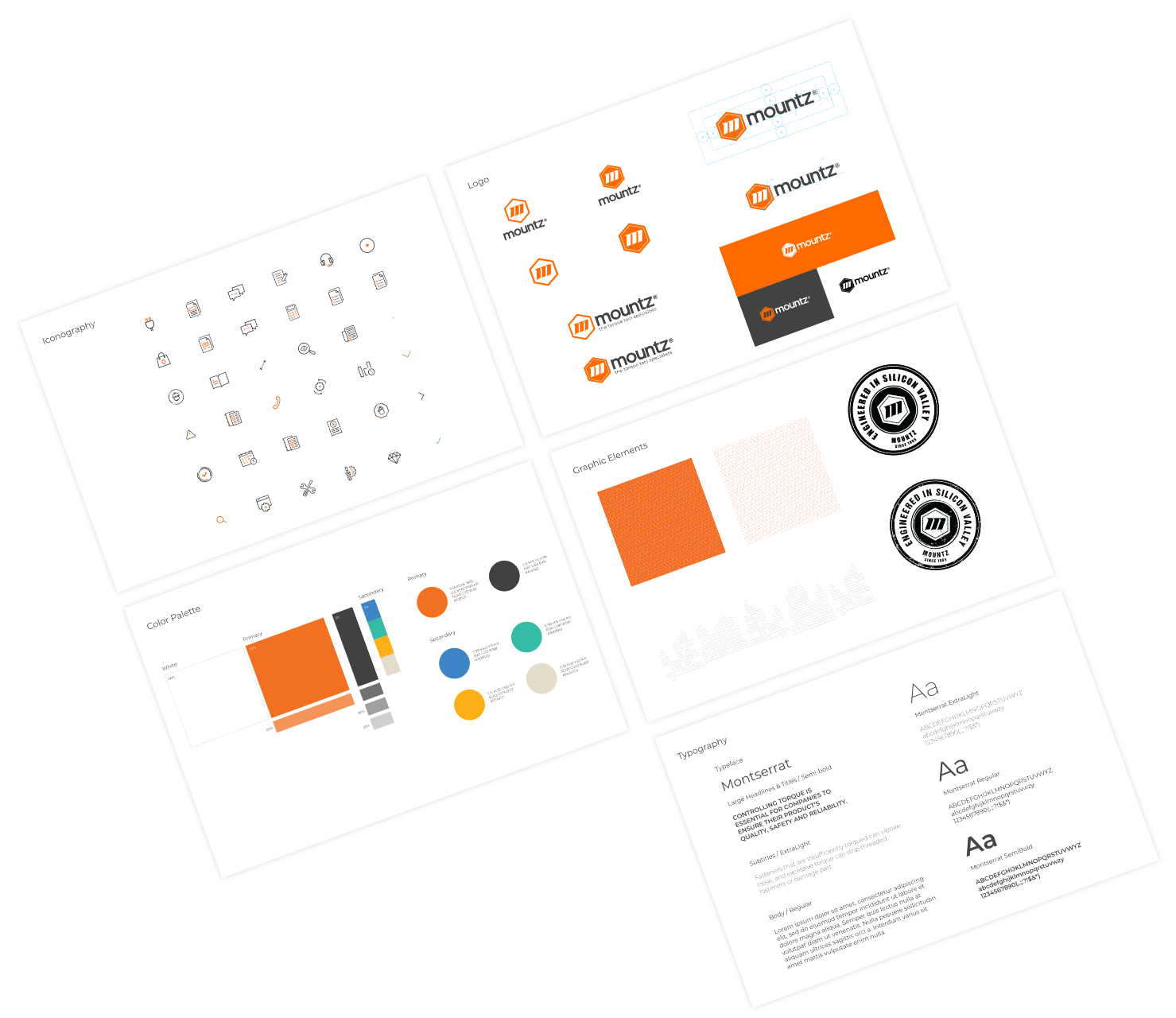
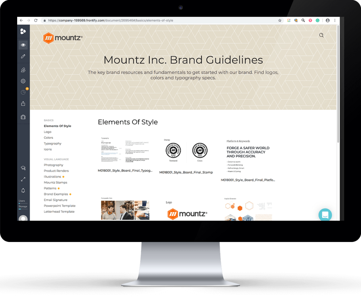
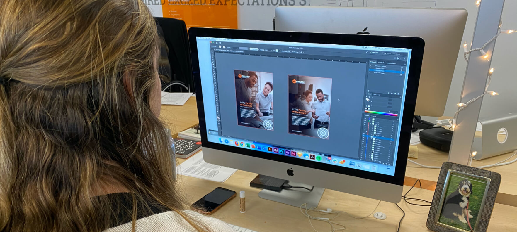
With the launch of the new brand, creating consistency was key for the Mountz marketing team. They had a number of resources developing materials and wanted to ensure all of the guidelines were easily accessible. We created a style guide that defined the full palette, shared iconography, fonts, and patterns—the whole working brand system. Rather than the traditional printed or PDF style guide that requires links to assets, we developed all of it in an online tool called Frontify. With a digital style guide, Mountz has the advantage of immediate revisions, as necessary. And creative resources can directly download supporting files from within the tool.

Showcasing the people using their tools is the essence of the updated Mountz photographic style. Selected imagery has a natural, action-oriented feel to it, with the primary objective of ensuring that the people using the tools showcase the confidence that comes from working with Mountz. To make stock photography more ownable, we also applied an orange overlay for a distinctive feel.
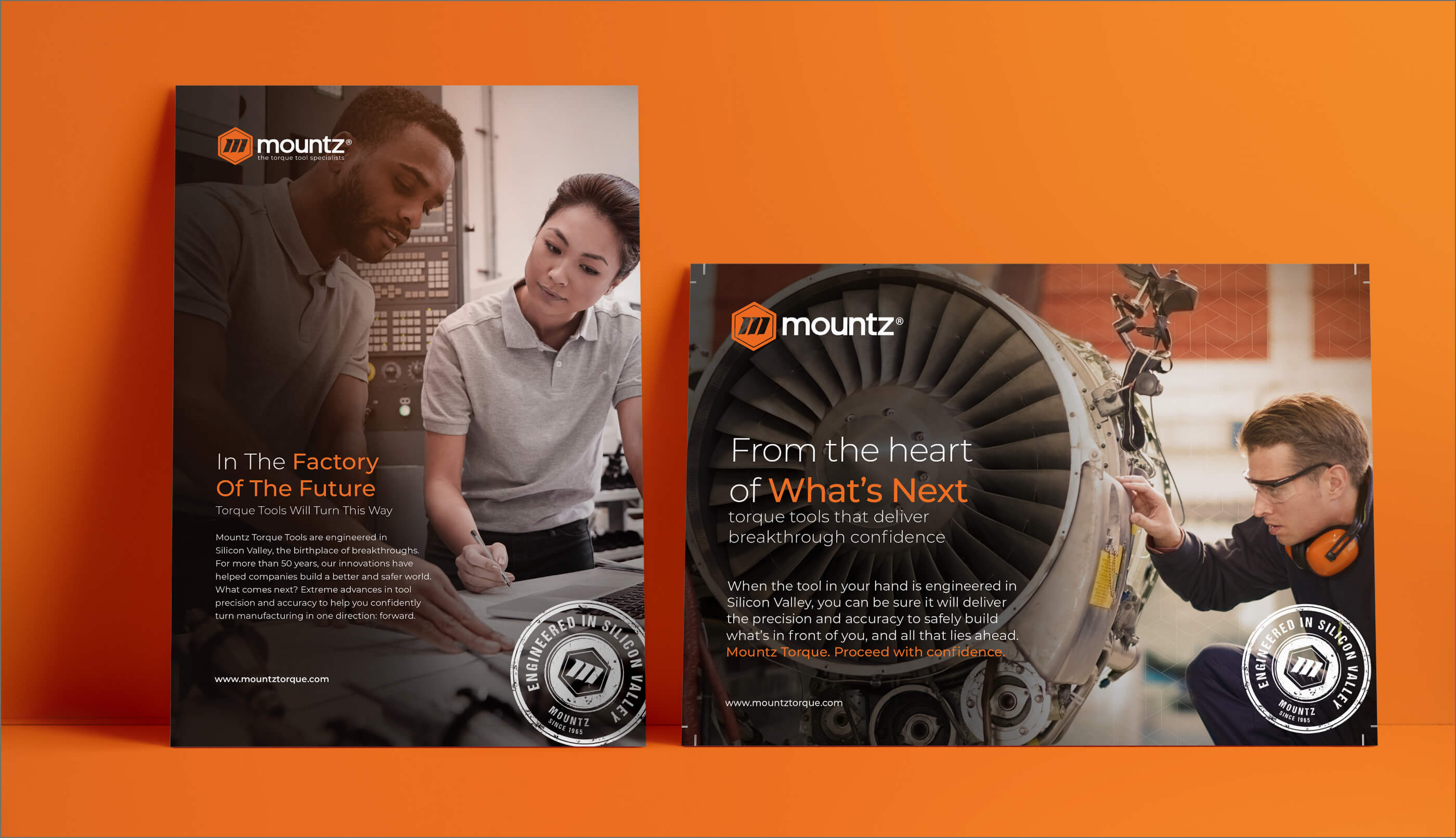
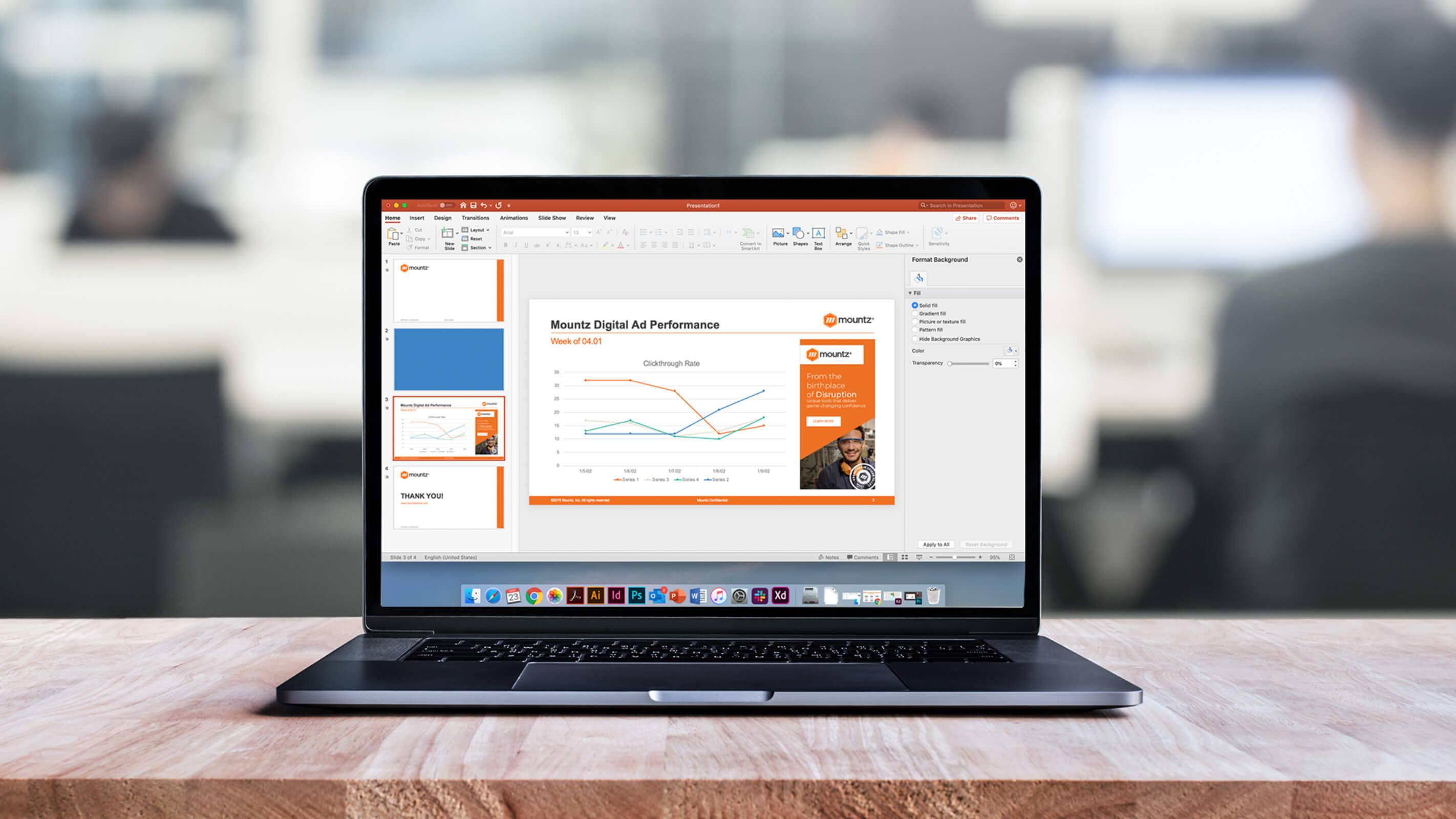
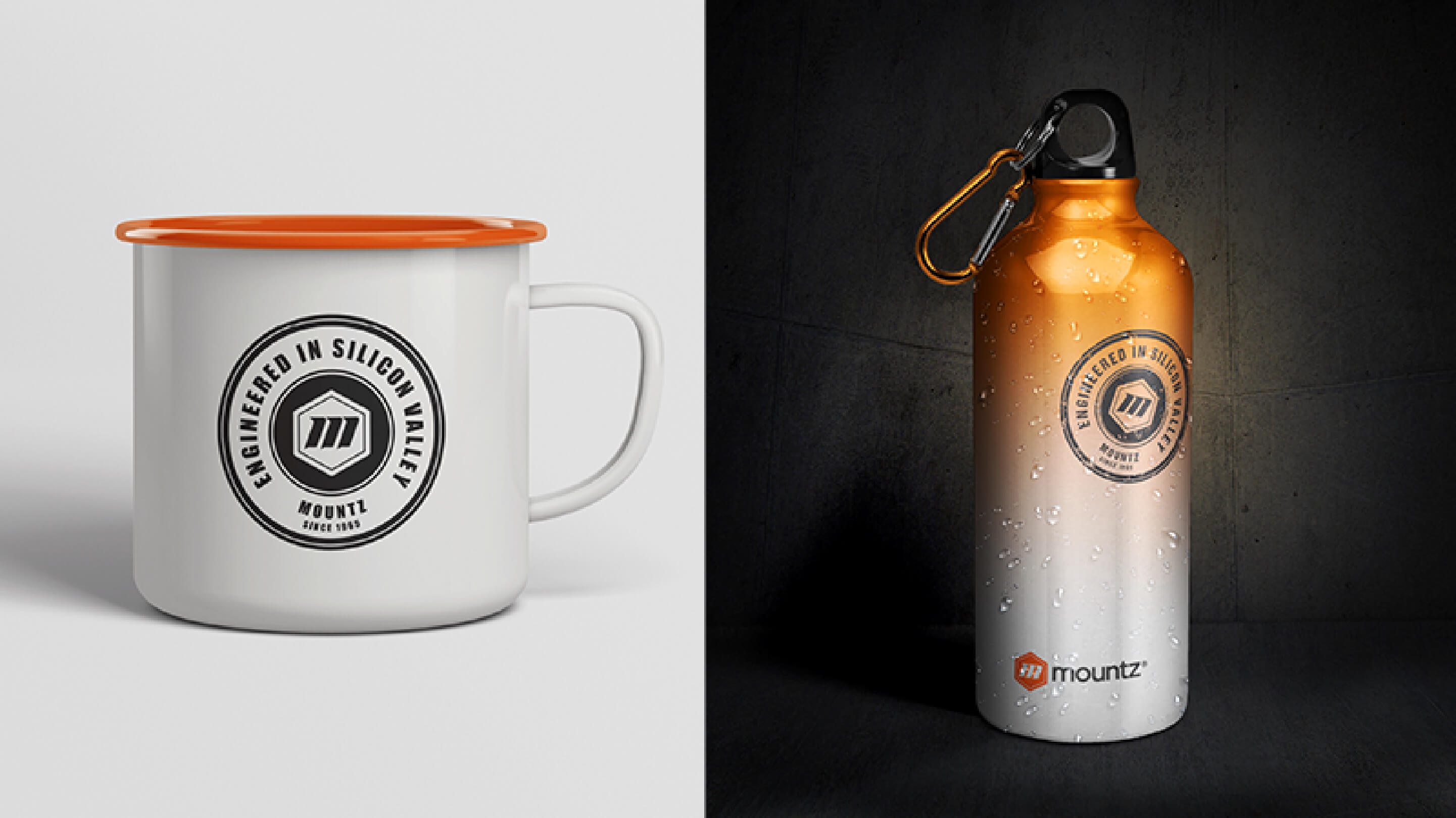
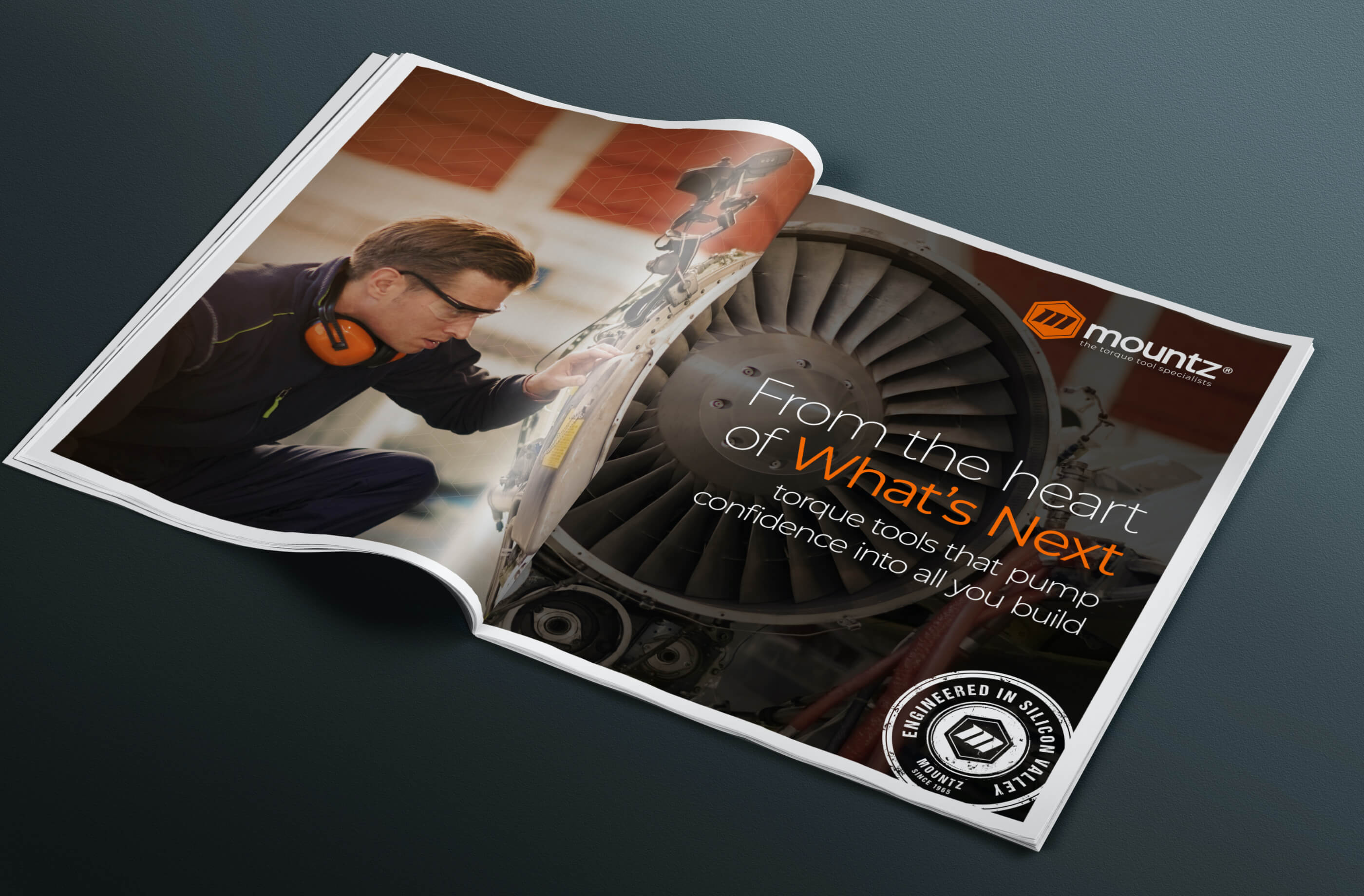
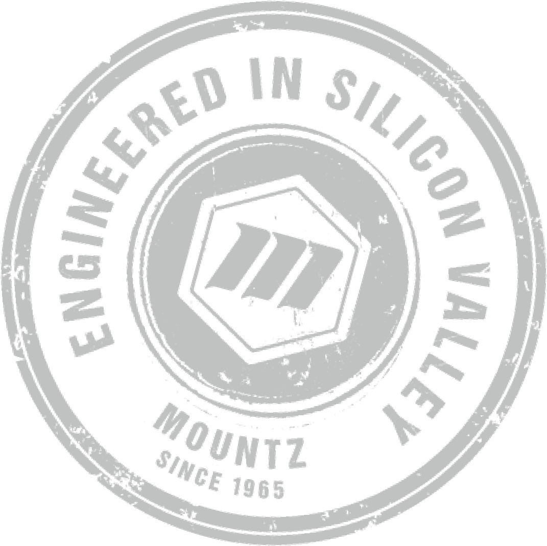
One of the core new elements of the Mountz brand was the “Engineered in Silicon Valley” stamp that the Clear Digital team developed. This was to highlight the brand’s heritage and help differentiate its tools in the marketplace. This pride in where they come from has become an essential part of the company’s brand expression and we were able to integrate it into a variety of applications — from t-shirts and caps, to their business suite and PPT template. The new brand was showcased in a variety of form factors, including tradeshow properties, stickers, and even a flag out in front of their building.

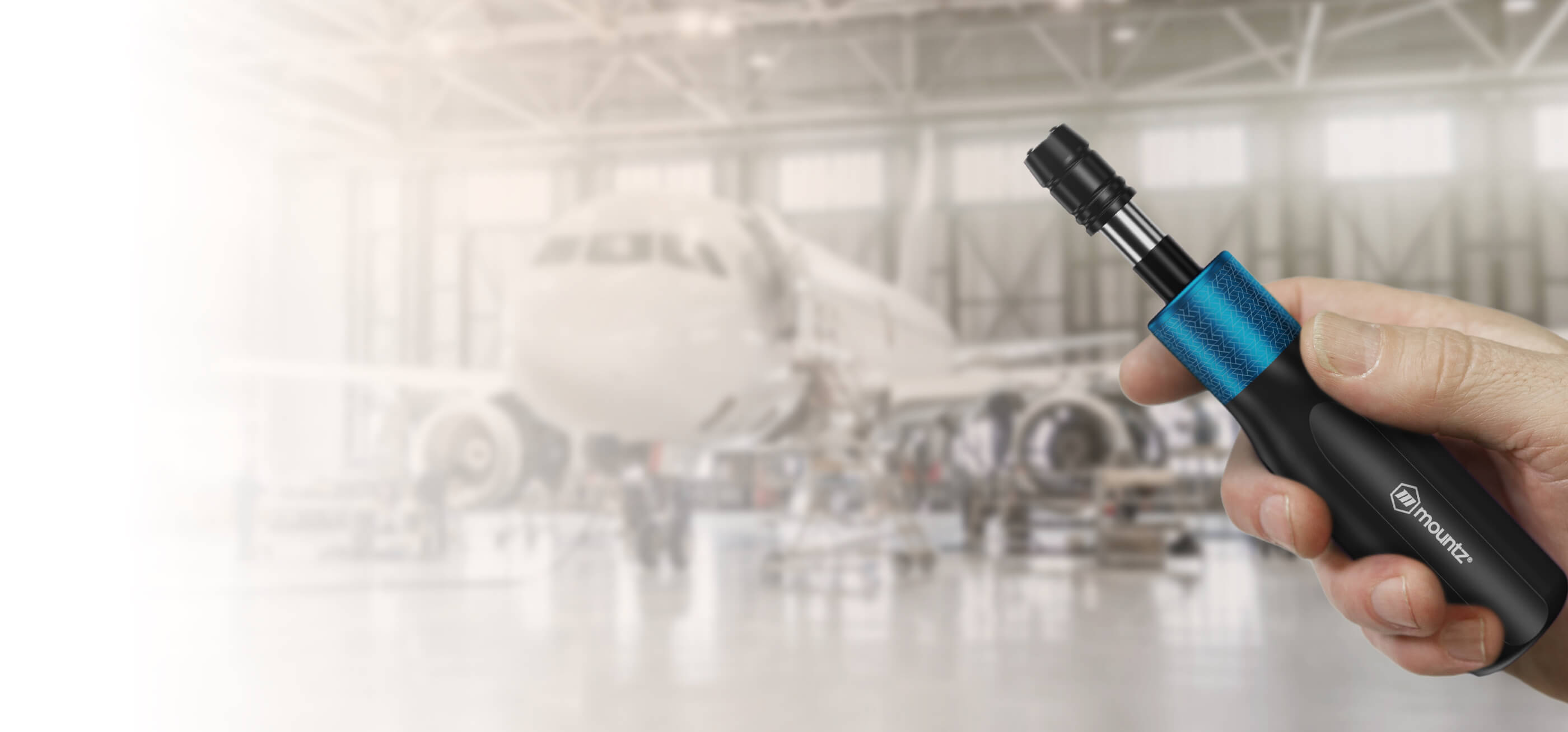
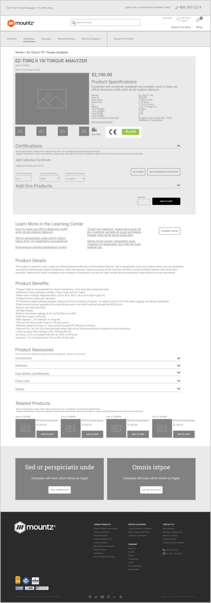
In addition to the relaunch of the corporate brand and the company website, Mountz also had an upcoming product launch planned. This was the perfect time to apply the upgraded logo and also gave the Clear Digital team the opportunity to weigh in on the industrial design and approaches. The FG line of precision tools are a leap ahead, and Mountz wanted to make sure its visual style felt like it, too. The tools have a sleek, modern feel and integrate metalized color labels for identifying different torque ranges. We helped define the color palette for these labels to ensure they connected with the brand and the high-end design of the tools.

With the launch of the new website, Mountz was doing something unprecedented in the industry: an integrated ecommerce site. While the company needed to use its existing content management system, Clear Digital provided responsive designs for key pages. The look and feel were a major upgrade from the previous site and beautifully showcased the new brand. In fact, for many Mountz audiences, the new website was their first and primary experience of the brand. And it was a world of difference.
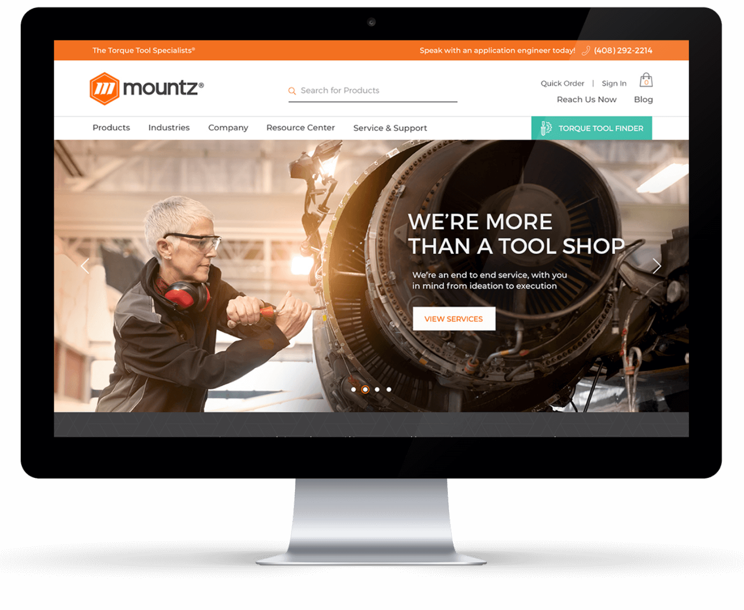
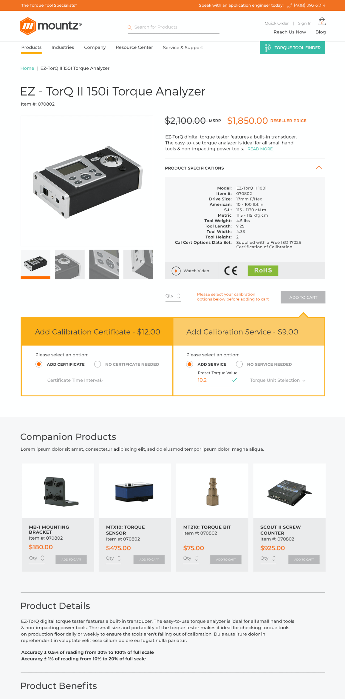
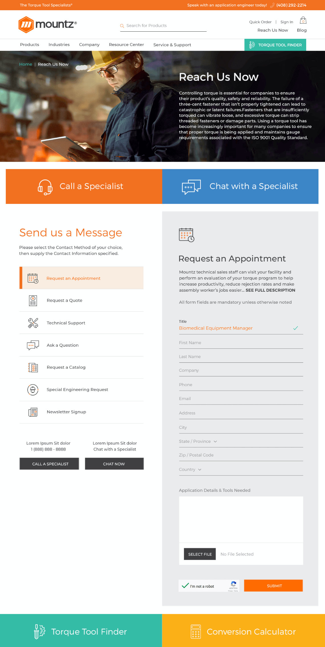
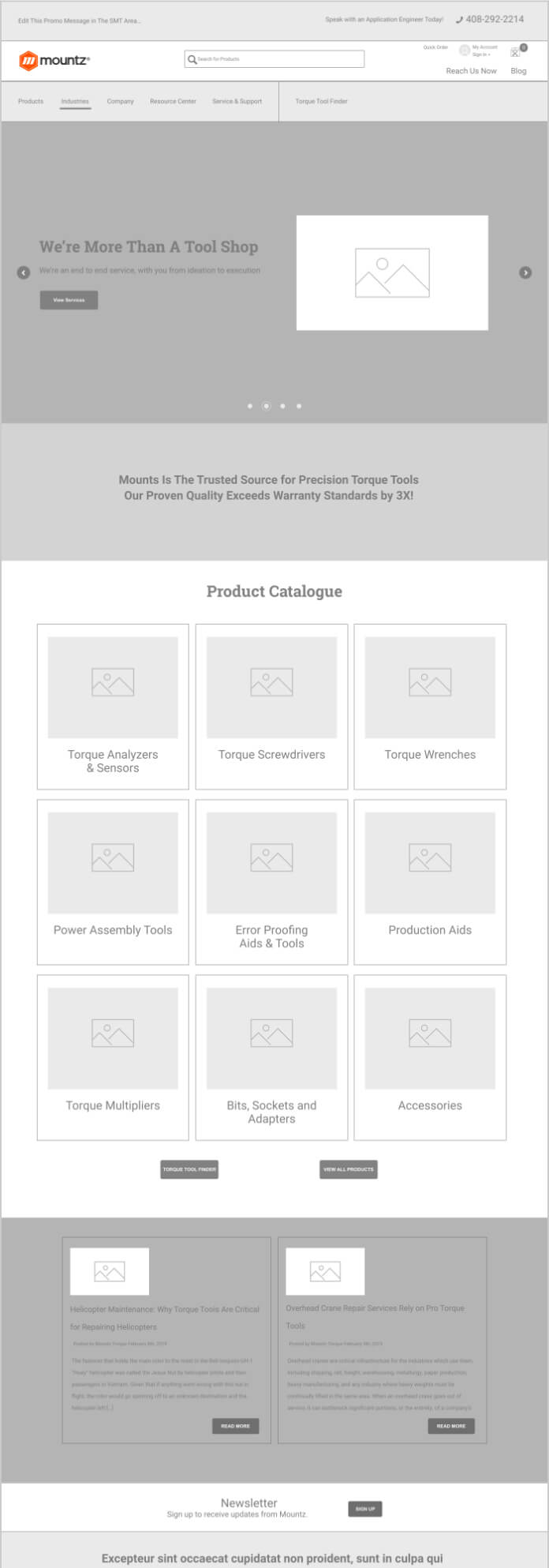
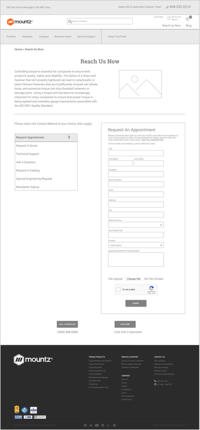
Because the Mountz website has eCommerce at its core, the wireframes for this site were different than more traditional B2B sites. The goal for every page was to get the customer to the Tool Finder or to order tools. We optimized the product and other key pages by reorganizing the content to quickly deliver on the product purchase experience.
Share your project details. We want to hear all about what you need.
Clear Digital is a founding member of Myrious Group's expertise-driven agencies.
Myrious Group is an independent holding company enabling forward-thinking brands to achieve breakthrough performance through power of orchestration.
Visit Myrious.com
© Copyright 2024 Clear Digital, Inc., a Silicon Valley / San Jose Web Design Company. All Rights Reserved.