In the B2B marketing realm, lead generation is the name of the game. You’ve done your due diligence, dedicated countless hours to establishing a unique position in the market, identified target personas in the buying cycle, and created rich, compelling content that lets your audience know exactly how your solution will help them succeed where others have failed.
But despite all this legwork, your site isn’t generating qualified leads at the rate it needs to be. What gives?
If your site is doing everything by the book and still experiencing lackluster results, it’s time to take a closer look at your strategy for giving a potential buyer the grand tour, then consider a few B2B web design best practices to improve your approach.
B2B sites must make far more intentional efforts than their B2C counterparts to funnel interested users as quickly as possible to the next step in the buying cycle.
Applying the Right Navigation Features for Your B2B Tech Website
There are a lot of B2B best practices in the current era for optimizing the site navigation experience, and we’ll detail some of them later in this article. But first, let’s talk about the two absolutely vital components all good web navigation has: organization and convenience.
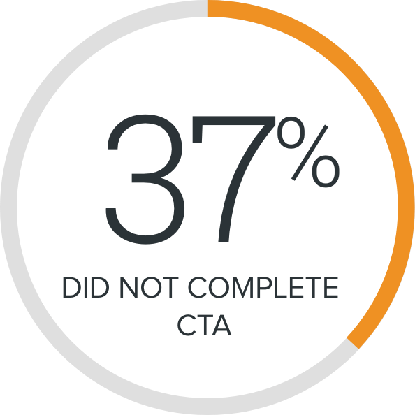
To help people connect quickly with the right information and calls to action, your website must set them up for success from the start by answering their most essential questions upfront and giving them a clear, big-picture view of your offerings. Follow that up with seamless, low-commitment opportunities to learn more, keeping in mind that poor web navigation design will always have the opposite effect. Remember that 37% that didn’t complete CTA? That number represents users whose global navigation experience made them too impatient, confused, or simply too frustrated to complete the next step in the purchasing journey.
A Note About Personalization
As you peruse website navigation design options, it’s important to note that functionality and features can (and should) vary depending on the industry you serve. For example, B2B websites serving the medical and healthcare fields will require navigation tools that look very different from, say, a website catering to the needs of cybersecurity companies clients. This is because the calls to action will invariably differ for each respective field. A medical technology site would likely provide a demo video illustrating a proposed solution, whereas being prompted to explore an ROI calculator could be more beneficial for an IT Security Manager who is contemplating the purchase of cybersecurity software.
Avoid Three Navigation Designs that Alienate Website Visitors
With those site fundamentals firmly in place, you can begin examining the various site navigation options to decide which combination best fits your sales and business needs. In this phase, it’s important to be open to new navigation structure techniques and methodologies. Research tells us that with increased frequency, the website visitor ignores outdated means of providing information. In other words, it’s no longer enough to simply link users to a form and hope for the best. Today’s users understand the value of their information, and they’re not going to hand it over without receiving useful ROI calculator results, white papers or other gated content, free trials, or other value offerings in exchange.
To choose the most effective approach in current website navigation design, it’s sometimes helpful to consider the least effective practices that too many websites still employ. Starting from a “devil’s advocate” perspective, ask yourself: What could my primary navigation do that would make a visitor give up and leave?
Here are some of the most common problems users encounter in website navigation, as well as B2B website best practices for correcting each issue and keeping website visitor attention on your site longer:
1. Unorganized navigation bar with too many items and overly simplistic dropdown menu.
Proposed B2B Website Best Practices:
Consider instead using a so-called mega menu that lets visitors access even the deepest sections of your website. A mega menu maximizes the use of space and can leverage full screen or full-width dropdown menus with visuals to promote a wider range of assets in the navigation design. This serves to reassure users they are never more than a click away from the information they need and allows you to promote those important lead gen CTAs.
2. Vague, non-descriptive links that don’t give users enough information about where they are headed on your site.
Proposed B2B Website Best Practices:
Effective link naming is a website navigation tool that ensures all links are meaningful and easy to follow. Each internal link should be labeled in a way that’s understandable and easy for target personas to distinguish. If a specific internal link is hard to understand, include a short description. Using effective links will ensure more time spent on your site by establishing trust and letting users know before they click exactly where each link will take them.
3. Inconvenient or easy-to-lose gated assets and calls to action.
Proposed B2B Website Best Practices:
“Sticky” main navigation, CTAs and locked assets solve this problem by locking priority messaging to the top of the browser, where it’s constantly visible and in focus as users scroll down the page. In some instances, the sticky navigation information can also reappear as a user scrolls up. This site feature can give guests helpful — and surprisingly unobtrusive — reminders to “get started,” “contact sales,” “free trials” or complete another task before leaving your site.
Navigating the Future of B2B Site Design
Website navigation was once a fairly simple exercise of organizing content and choosing the shortest pathway to get from one page to another. That’s all changing thanks to machine learning, personalized web experiences, and tech savvy visitors driving the day-to-day interactions on the web. As a result, smart navigation design has become an essential component in creating websites.
Lead Gen Is Still King
At the end of the day, lead generation still is and will continue to be the end-goal for every website design and navigation menu optimization project. As a tech company working in the B2B space, you can ensure a successful site visit and generate more leads by employing B2B website design best practices, global navigation design approaches, techniques, and features at your disposal.
Don’t be afraid to mix and match these tools to create the site navigation experience you know your users want. After all, no one knows your clients better than you. You’ve got the right solutions, a solid overall design, and compelling content in place. Now it’s time to give prospects the very best grand tour your site has to offer, and convert their interest into qualified leads for your business.
From web design, CMS websites, applications, ecommerce, motion graphics and multimedia, graphic design, and print, to Internet marketing solutions, we’ve got you covered.
Get our latest news, insights, and project spotlights delivered directly to your inbox.
* We are the sole owners of the information collected on this site. We only have access to/collect information that you voluntarily give us via email or other direct contact from you. We will not sell or rent this information to anyone.