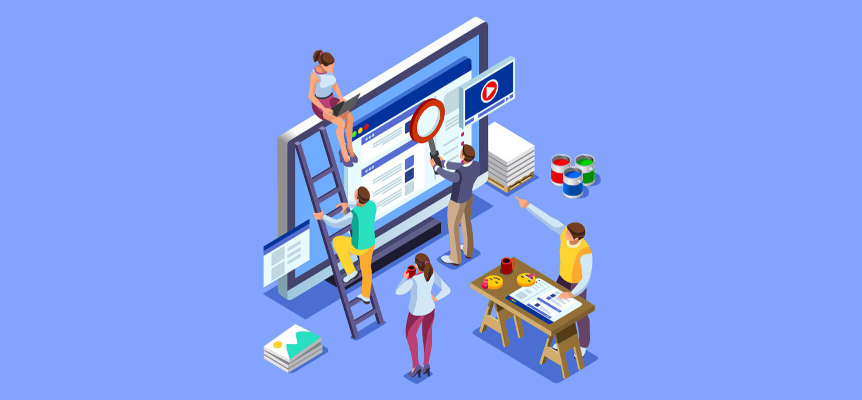
As dedicated design geeks, we like to keep our finger on the pulse of what’s going on in the world of web design. From time to time, we also like to share our opinions about what’s hot and what’s not. (It’s a design thing, we can’t help it.) Here are the trends we think will soon take center stage, and those we expect (hope?) will be bowing out.
Full page push
Sometimes it’s okay to be a pushover—like when it makes for a super cool scroll. We love transitioning between screens by pushing the full page in and out of view, like opening or closing a sliding door but from any direction, while keeping some items persistent. It feels futuristic and old school all at once. See for yourself.
A softer shape
We’re saying goodbye to straight, sharp-edges and hello to more organic, oblique shapes for a new visual style that’s both soft and strong. Because we could all stand to mellow out a little.
Site becomes experience
It’s easy to get carried away with fancy design, but if you want to appeal to product users and keep them coming back, you need to keep content in focus on both web and mobile. Present visuals in a clear order and make good use of white space to make it easy to understand. Get rid of “design clutter” and strike the perfect balance.
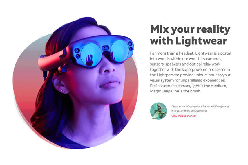
Bringing 3D to the masses
While 3D software used to be expensive and difficult to use, the technology has become simpler and more affordable, which is why we expect to see more of simple 3D and faux 3D animations sprinkled into sites. That, and they’re pretty awesome.
Feeling flat? Change your perspective.
To add more life to the flat screens we view websites on, try playing with 3D skewing and distortion of 2D elements, such as video and photos. Shifting the perspective adds depth, dimension, and a playful touch that users will love. Check out how this artist made his portfolio pop.
Add a splash of color
For balanced design that’s bold but not too heavy, try adding bright, saturated splashes of color gradients paired with large areas of negative white space. It’s a simple but effective way to make certain elements pop without overloading the eye. Feast your eyes on this site to see what we’re talking about.
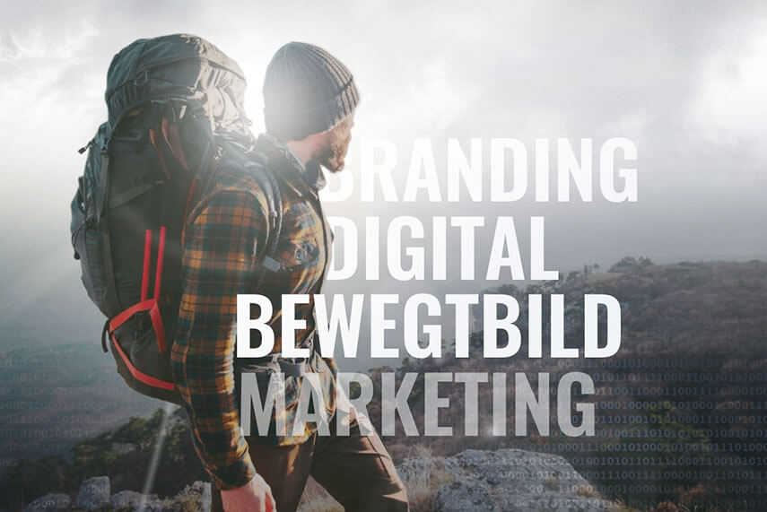
Typography with a twist
Giving the typography a makeover is a great way to refresh any website, and we’re not just talking about changing your font. Try layering type with other elements for a baked-in feel, or make it interactive—we love this big, bold typeface that stands on its own.
Creating experiences & making connections
It’s no secret that consumers today are suffering digital overload, and companies are looking to cut through the noise and make personal connections. Augmented reality (AR) and gamification can add depth to user experiences and create emotional connections. They also allow companies to boost engagement, collect data, and make personalized recommendations to strengthen brand associations.
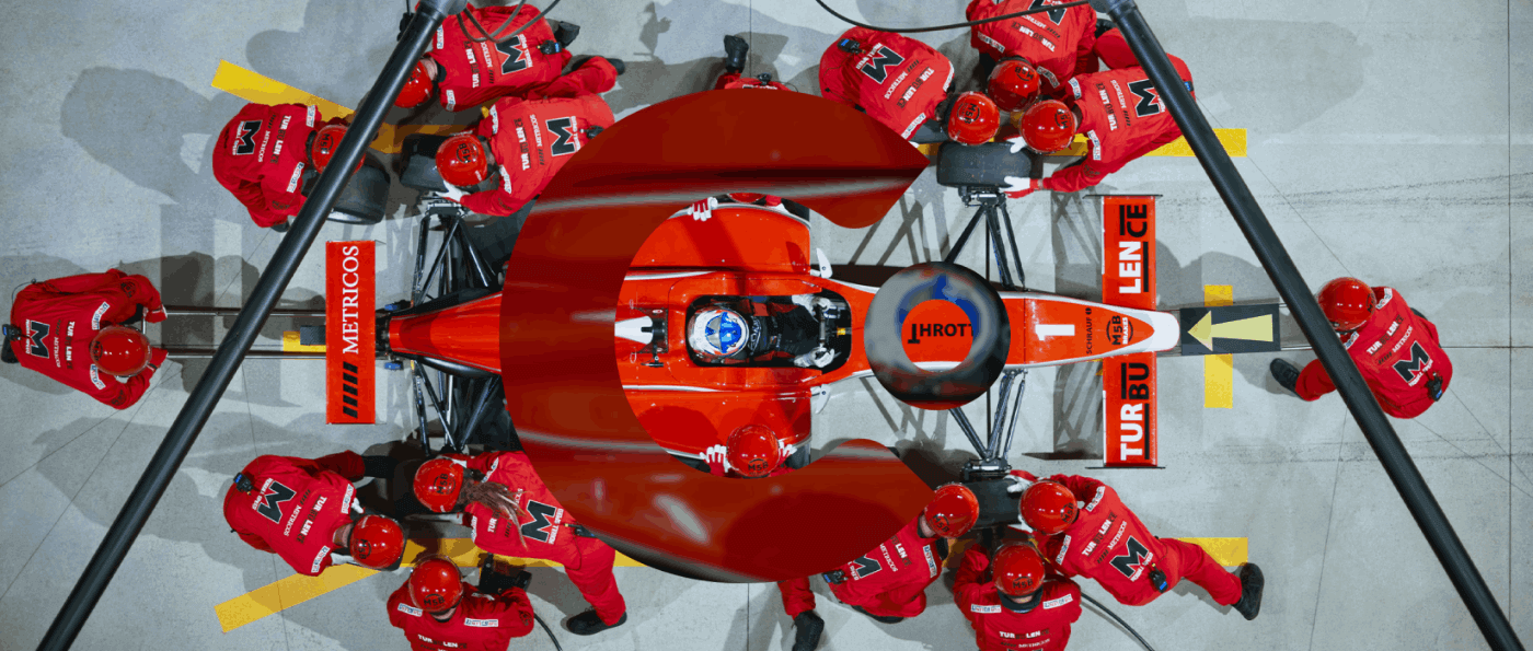
A new kind of animation
We’re excited to use more HTML SVG 5 based automations to breathe new life into infographics and add sleek, next-level animations to any element of a website. Take a look at what we did for Sand Hill Global Advisors and Globality and you’ll understand why this one rounds out our “hot” list.
On the way out
Just as fashion trends come and go (we’re looking at you, rompers), so do web design trends. We’d like to lay to rest, or at least limit use of, the following outdated, overused, or ineffective trends.
Parallax overload
Parallax has been used to create greater visual interest and excitement in websites for a few years now. Let’s be honest, it’s gotten to be a lot. In fact, in some applications it’s become downright distracting and takes away from the message. Plus, it can slow load times and lower SEO, which is why we recommend treading lightly. Use parallax sparingly to draw attention and add dimension to select sections of a site.
All about that space We’re also seeing a rise in the use of unique, stylized fonts in the form of custom or hand made typography. While creative fonts are cool, bad spacing and size discrepancies are not. Unfortunately, the two often go hand in hand.
Slow your roll (or rather, shorten your scroll)
We’ve seen enough of the endless page that scrolls on forever—has anyone ever made it to the bottom? Similarly, overuse of large imagery, which not only distracts from the content but slows down page performance, has had its day. Think less is more.
Leading with social links
Yes, everyone loves social media—but that doesn’t mean you should put your links at the top of you page, which can lead users away from your site. And since we all know how easy it is to fall down the social media rabbit hole, we should also know once you lead them away, they may never come back. Don’t make social links a main attraction.
Round and round the carousel
Image and content carousels may seem fancy, but the data shows that many users don’t click past the first item. The drop off for second and third images is really high. Instead, we suggest making the page scannable and bringing more of that important content out into the open.
From web design, CMS websites, applications, ecommerce, motion graphics and multimedia, graphic design, and print, to Internet marketing solutions, we’ve got you covered.
Get our latest news, insights, and project spotlights delivered directly to your inbox.
* We are the sole owners of the information collected on this site. We only have access to/collect information that you voluntarily give us via email or other direct contact from you. We will not sell or rent this information to anyone.